Categories: AI Copilot
0PTIKUBE Review: AI K8s Visualization or Just Hype?
We love Kubernetes. We really do. It’s the powerhouse behind modern infrastructure, a marvel of engineering that lets us juggle containers like a seasoned circus performer. But let’s also be honest about the other side of the coin. On some days, particularly around 2 AM during an outage, we also want to throw our laptops out the window because of it.
It’s a beast. A glorious, scalable, resilient beast. But a beast nonetheless. The sheer complexity of tracking pods, services, deployments, and resource requests across a sprawling cluster can be… a lot. Trying to figure out why a specific pod is getting OOMKilled in a cluster with hundreds of nodes can feel like performing keyhole surgery in the dark. With someone shouting YAML files at you.
For years, we’ve cobbled together solutions. We stitch together Prometheus for metrics, Grafana for dashboards, and maybe a dash of `stern` or `kubetail` for logging. It works. But it’s a manual, often reactive process. So when I stumbled upon a tool called 0PTIKUBE, which promised Kubernetes visualization with AI-powered recommendations, my curiosity was definitely piqued. Another buzzword-laden promise, or something actually useful? I had to find out.
So, What on Earth is 0PTIKUBE?
At its heart, 0PTIKUBE bills itself as a Kubernetes visualization and optimization tool. It’s built for the people in the trenches: DevOps teams, platform engineers, and SREs. The goal isn’t just to show you what’s happening in your cluster, but to help you understand it and, more importantly, make it better. The big hook is the “AI-powered recommendations” part, suggesting it can proactively spot trouble and suggest fixes.
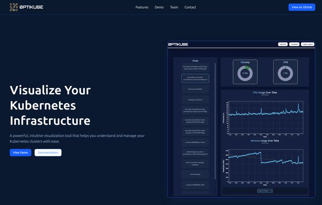
The first look at their dashboard is clean. It’s got that modern, dark-mode aesthetic that we’ve all come to love. You see your core metrics right away—CPU, Memory, and that all-important cost data. It looks intuitive, which is already a big win in the Kubernetes world. No one needs another tool with a learning curve as steep as K8s itself.
Visit 0PTIKUBE
More Than Just a Pretty Dashboard
Digging a bit deeper, 0PTIKUBE seems to hang its hat on three main pillars:
- Real-time Monitoring: This is table stakes for any K8s tool, but it’s the foundation. It promises a live, real-time view of your cluster’s health. Not a snapshot from five minutes ago, but what’s happening right now. This is critical when you’re trying to correlate a deployment with a sudden spike in latency.
- Kubernetes Infrastructure Visualization: This is where things get interesting. Instead of just lists of pods and nodes, 0PTIKUBE offers a visual map of your infrastructure. Seeing how services connect, where dependencies lie, and how resources are distributed can be a game-changer. It’s the difference between reading a list of street names and looking at a satellite map of a city. You just get the bigger picture instantly.
- AI-Powered Resource Optimization: Here’s the magic sauce. The tool claims its AI can identify resource bottlenecks and suggest optimizations. Are your CPU requests and limits way off? Is a service hogging memory and starving its neighbors? The idea is that 0PTIKUBE will flag these issues and tell you, for example, “Hey, you’ve provisioned 4 cores for this pod, but it hasn’t used more than 0.5 in a month. You could save some cash here.” If it works as advertised, that’s not just an operational win; it’s a financial one.
The Good, The Not-So-Good, and The YAML
No tool is perfect, right? After poking around, I’ve got some initial thoughts. I’m an optimist, but a cautious one. I’ve seen too many tools promise the world and deliver a small, buggy continent. Here’s my breakdown, based on what’s available.
| What I’m Excited About | What Gives Me Pause |
|---|---|
| The promise of AI-driven recommendations is huge. Less guesswork, more data-driven decisions. | The term “AI” is vague. How much can you customize it? Is it a black box, or can I tweak its sensitivity? |
| An intuitive, unified view could save countless hours compared to juggling three different monitoring tabs. | The biggest question mark of all: there’s no pricing information available on the site. More on that later. |
| Identifying resource bottlenecks automatically is a dream for performance tuning and cost savings. | It seems to be a newer tool. Will it have the community support and battle-tested reliability of older solutions? |
Who is This Tool Really For?
This seems squarely aimed at teams that have moved past the “just trying to get Kubernetes to work” phase and are now in the “how do we run this efficiently and reliably at scale?” phase. If you’re a platform engineer building an internal developer platform, a tool like this could be a massive value-add, giving your developers self-service visibility without them needing a PhD in Kubernetes internals.
For SREs and DevOps folks, its a potential force multiplier. Imagine getting an alert that isn’t just “CPU at 95%” but “CPU at 95% on these pods because of a memory leak we’ve identified in the latest deployment, and here’s a recommendation to adjust the memory limits.” That’s the dream.
The Elephant in the Room: How Much Does It Cost?
Okay, let’s talk about the big one. I clicked on every link. I looked for a pricing page. And you know what I found? A 404. A “This page could not be found” error. While that might be a simple website bug, the fact remains: we don’t know the price.
This isn’t uncommon for new B2B or dev tools. Often it means they are targeting enterprise customers with a “Contact Us for a Demo” sales model. That can be fine, but it’s a bit of a bummer for smaller teams or individual engineers who just want to try it out. I’ve always been a fan of transparent pricing. Let me know if I’m looking at a $50/month tool or a $5,000/month commitment. I hope they clarify this soon because it’s a major hurdle for adoption.
The site does have a “View on Github” button, which is promising! This might suggest an open-source core with a paid enterprise version, a model that many of us in the community appreciate. But without a clear link or more info, it’s just speculation for now.
Frequently Asked Questions about 0PTIKUBE
So what is 0PTIKUBE, in short?
It’s a monitoring and visualization tool for Kubernetes clusters. Its main selling point is using AI to not only show you what’s happening but also to recommend optimizations for performance and cost.
How is this different from my current Prometheus + Grafana setup?
Think of it as the next step. Prometheus and Grafana are fantastic, but they are generic tools you configure for Kubernetes. 0PTIKUBE is purpose-built for Kubernetes from the ground up. The key difference is the proactive, AI-driven recommendation engine, which you typically have to build yourself in a Grafana setup.
Is 0PTIKUBE open source?
It’s a little unclear. The presence of a “View on Github” button on the homepage strongly suggests there is an open-source component. This could be an open-core model, but the exact details aren’t spelled out on the website yet. I’d keep an eye on their GitHub presence to find out more.
How does the ‘AI’ part actually work?
The site doesn’t go into deep technical details, but we can infer. Most likely, it analyzes historical usage patterns of your pods and nodes (CPU, memory, etc.) and compares them to their requested resources. It would use machine learning models to detect anomalies, predict future usage, and identify patterns that indicate waste (e.g., consistently over-provisioned pods).
Who is the ideal user for 0PTIKUBE?
Any team or individual managing non-trivial Kubernetes clusters. This includes Platform Engineers, DevOps Engineers, and SREs who are focused on reliability, performance, and cost efficiency.
How much does 0PTIKUBE cost?
That’s the million-dollar question! As of now, pricing is not public. The common path for tools like this is a custom quote based on a demo, especially for enterprise features. Hopefully, we’ll see a more transparent pricing tier for smaller teams in the future.
My Final Two Cents
So, is 0PTIKUBE the answer to all our Kubernetes woes? Probably not. No single tool is. But is it a genuinely exciting step in the right direction? Absolutely. The idea of moving from a reactive to a proactive, recommendation-driven approach to cluster management is incredibly appealing. It’s exactly where the industry needs to go.
It takes the concept of observability and adds a layer of actionable intelligence on top. It’s like finally getting that satellite view after years of performing keyhole surgery in the dark. The lack of clear pricing and details on the AI’s inner workings are definite drawbacks for now. But for a tool this promising, I’m willing to be patient. I’ve hit their “Contact Us” button, and I’m genuinely excited to see a demo. If you’re tired of wrestling with YAML and wish your dashboard could think for itself, you should probably do the same.


