Categories: AI Color Palette Generator, AI Design Assistant, AI Design Generator
Perception.io Review: An AI Color Psychology Tool?
How many hours have you lost staring at a color wheel, trying to find that perfect shade of blue that says ‘trustworthy’ but also ‘innovative’ without screaming ‘generic tech startup’? Yeah, me too. It’s a special kind of creative purgatory. We’re told color is everything—it sets the mood, drives conversions, builds a brand. No pressure, right?
As someone who’s spent years in the trenches of SEO and branding, I’ve seen fantastic products fail because their visual identity just didn’t connect. It’s a painful thing to watch. So when I heard about an AI tool called Perception.io that claims to take the guesswork out of it using color psychology, my cynical-but-curious brain lit up. Another AI tool, you say? Groundbreaking. But this one felt a little different. It wasn’t just generating pretty gradients; it was promising to infuse them with meaning. I had to see for myself.
Visit Perception
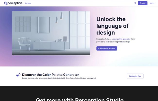
So, What Exactly is Perception?
At its core, Perception is what they call a “design intelligence tool.” Fancy term, right? Basically, it’s an AI-powered color palette generator. But the secret sauce, the thing that makes it stand out from the countless other color pickers out there, is its foundation in color psychology. Instead of just giving you mathematically complementary colors, it tries to understand the mood and emotion you want to convey and builds palettes around that.
It’s like having a color psychologist and a senior designer whispering in your ear. You’re not just picking colors; you’re building a feeling. For a marketing and traffic guy like me, that’s gold. Because feelings, my friends, are what lead to clicks and conversions.
Why Color Psychology Isn’t Just Fluff
I can already hear some of you. “Color psychology? Isn’t that a bit… woo-woo?” I get it. The internet is filled with infographics telling you “green means nature” and “yellow means happiness.” It’s often oversimplified to the point of being useless. But the real application of color psychology in branding and web design is incredibly powerful.
Think about it. The color of a CTA button can genuinely impact click-through rates. The palette of a website can make a visitor feel either overwhelmed or at ease. It’s subconscious communication. According to a study I once read from the University of Winnipeg, people make a subconscious judgment about a product within 90 seconds of initial viewing, and between 62% and 90% of that assessment is based on color alone. That’s not fluff; that’s a massive conversion lever waiting to be pulled. Perception aims to give you a hand on that lever.
A Look Inside Perception’s Toolkit
So how does it actually work? I spent some time playing around with the platform, and a few features really stood out.
The AI Color Palette Generator
This is the main event. You don’t start with a color; you start with a word. A prompt. You can type in something like “calm and professional” or “energetic and youthful,” and the AI gets to work, churning out multiple palette options that fit the brief. It’s surprisingly intuitive. Instead of you trying to translate a feeling into hex codes, you let the machine do the heavy lifting. This is a massive time-saver, especially in the early brainstorming phases of a project.
The Palette Validator: Your Personal Color Coach
Okay, this one’s cool. Let’s say you already have a brand palette, but you’re not sure if it’s really… working. The Palette Validator lets you plug in your existing colors, and it analyzes them. It breaks down the perceived moods and psychological impact of your current scheme. I found this incredibly useful. It’s one thing to think your colors say “dependable and modern,” it’s another to have an AI analyze it and come back saying it’s actually perceived as “reserved and simple.” It’s like a brutally honest friend for your brand guide.
The Palette Dictionary: A Mood Board for Colors
If you’re stuck for ideas, this is your starting point. The Palette Dictionary is a library of pre-built, mood-based palettes. You can search for terms like “Trust,” “Playful,” or “Luxury” and get instant inspiration. It’s less about a specific project and more about exploring the emotional landscape of color. I found myself just browsing through it, getting ideas for future projects. Its a great resource for getting the creative juices flowing when you’re feeling blocked.
Let’s Talk Money: Perception’s Pricing Tiers
Alright, the all-important question: how much does this cost? Perception keeps it pretty straightforward with three main tiers. No weird credit systems, thank goodness.
| Plan | Price | Best For |
|---|---|---|
| Perception Lite | $0 / member | Individuals or small projects. A fantastic way to test drive the platform without any commitment. You get the core idea, but with some limitations. |
| Perception Studio | $14 /month/member | Professional designers, freelancers, and small teams. This unlocks the unlimited features and is really the main offering. The price feels very reasonable for the time it can save. |
| Perception Enterprise | Contact Sales | Larger agencies and creative teams who need collaboration tools, SSO, and dedicated support. The big leagues. |
Frankly, the free tier is generous enough to get a real feel for it, which I appreciate. You can generate a few palettes and use the validator, which is more than enough to decide if the full-featured Studio plan is worth the investment for your workflow.
My Honest Take: The Good, The Bad, and The “It Depends”
So, is Perception the silver bullet for all your color woes? Not exactly. No tool is. Its reliance on AI is both its greatest strength and a potential weakness. On one hand, generating research-backed palettes in seconds is a game-changer. It cuts down on endless debates and gives you a solid, defensible starting point for client presentations. The time-saving aspect alone is a huge win.
However, if you’re a designer who finds joy in the messy, unpredictable process of manual color discovery—of stumbling upon that perfect, unexpected combination—you might feel a bit constrained. Sometimes the best ideas come from happy accidents, not algorithms. The subscription is also a factor. While the free plan is great, the real power is locked behind that monthly fee, which might be a hurdle for hobbyists.
“Perception doesn’t replace a designer’s intuition; it augments it. It’s a compass, not a map.”
Who is Perception For (And Who Can Probably Skip It)?
After playing with it, I have a pretty clear idea of who would get the most out of this tool.
This is a fantastic tool for:
- Freelance designers and small agencies who need to produce high-quality, rationale-backed work quickly.
- Marketing professionals and brand managers who aren’t design experts but need to make informed decisions about visual identity.
- Web developers who need to quickly spin up a visually appealing color scheme for a project without spending hours on design theory.
- Anyone who gets paralyzed by choice when facing a color wheel.
You might want to skip it if:
- You’re a designer who loves the manual, serendipitous process of creating palettes from scratch.
- You’re purely a hobbyist who doesn’t need the advanced features or doesn’t want another subscription.
Frequently Asked Questions
Is Perception’s color psychology analysis actually accurate?
It’s based on established principles and a large dataset, so it’s far more than a guess. It provides a strong, data-informed perspective. However, color perception can be subjective and culturally influenced, so it’s best used as a powerful guide, not an absolute rule.
Can I export palettes to my design software?
Yes! The paid plans (Studio and Enterprise) allow you to export your generated color palettes to Adobe tools, which is a crucial feature for a professional workflow.
What happens if I cancel my Perception Studio subscription?
Typically with SaaS models, you would retain access until the end of your billing period. You would likely lose access to the premium features and unlimited generation, and your account would revert to the limitations of the free Lite plan.
Is the AI just pulling from a template library?
No, it appears to be genuinely generative. Based on your text prompts, the AI creates new, unique combinations rather than just pulling up pre-made templates that match keywords. This allows for more nuanced and specific results.
Can I use it for an existing brand?
Absolutely. The Palette Validator tool is designed specifically for this. You can input your existing brand colors to get an AI-powered analysis of the moods and feelings they evoke, which can be useful for a brand audit or refresh.
Final Thoughts
I came in skeptical, and I’m walking away quietly impressed. Perception.io isn’t trying to replace designers. It’s trying to give them, and other creative pros, a smarter starting block. It successfully bridges the gap between abstract emotional goals and concrete design assets. By baking color psychology into the generation process, it saves time and, more importantly, adds a layer of intention to your work.
If you’ve ever struggled to justify your color choices to a client beyond “it just looks good,” this tool could be your new best friend. It gives you the ‘why’ behind the ‘what’. And in a world where every design choice needs to be a smart one, that’s a pretty powerful thing to have in your back pocket.


